
The following post is a guest post from the very talented blog designer, Peter Flaschner, as part of the blogging for beginners series.
Hi all. I’m Peter Flaschner, the founder and creative dictator at The Blog Studio. I’m going to walk you through the process we go through when designing a blog or other website. This is part one of two. When we’re done, we’ll have a super flexible WordPress theme perfect for anyone looking to make a buck with a blog.
Design can add tremendous value to a blog. When it comes to making money with your blog, proper web design can make a huge impact on your bottom line. For some reason, I get a lot of resistance when I say this. I think it has to do with one’s perceived definition of design. The typical response I get is ‘ugly sites do well with adsense’. That may very well be true. I bet though, that those same sites would do even better with proper design.
Before we get into this, I need to dispel one further myth: design is not about making things pretty. It’s about making things work to their best ability. Let me quote from dictionary.com:
We’re going to start by collecting a bunch of information. I know the instinct is to jump straight into your drawing program and start messing around, but it’s not the best approach. You’ll see why as we move through this.
We’re going to design a site for a fictional problogger. This person (let’s call him Fred) writes about watches. He’s earning a couple of hundred bucks a month from his current site, and wants to step that up.
Step 1: Identify the site’s goals (what are you trying to do? How will you achieve it)
We’re designing this site to increase Fred’s profit. We’re going to do this by designing a flexible framework for Fred to experiment with ad placement, by increasing the attention grabbing aspect in order to capture more first time visitors, and by increasing the site’s stickiness, giving users more chances to see an ad that they want to click on.
While we’re at it, we’re going to use a plugin we recently developed that will give Fred control over the colour of the various elements of his site. This way, he’ll be able to keep things looking fresh.
Step 2: Identify your audience (who are they, and where do they come from)
Fred’s audience is made up of two groups: hardcore watch nuts, who read Fred’s site for news and reviews of the latest timepieces, and people shopping for watches, who come to the site via searches for specific makes and models.
Step 3: Identify specific needs (what functions does the site need to have in order to meet its goals?)
Flexibility with a minimum of fuss is key here. We want Fred to be able to move ad blocks around without having to mess with the code. We also want Fred to be able to change up the look of his site to keep things fresh, again, without messing with the code.
We also want to increase the site’s stickiness. We’ll do this by including a “favorite posts” listing and related links in the post’s footer.
We’ll show a category listing, to allow readers to explore the site in a non-linear way, and a search bar, so readers can search for specific makes or models. We also want to include a blogroll, to share the love. Finally, we want to show recent comments, so Fred’s regular site visitors can keep up with the overall conversation.
Step 4: Draw wireframes (rough sketches to experiment with element placement and layout)
Now the fun starts. I use a fabulous program called OmniGraffle (mac only) to play around with site layout and element hierarchy (more on this in a moment). I like to stay out of my graphics editor, since the potential to get sucked into designing visual elements is so strong. You really want to avoid jumping into the visual part of the design at this stage, since you’ll just end up getting lost.
What we’re doing now is building the terrain that we’ll lay our visual elements over. Skipping this stage is is the single biggest mistake newbie designers make.
Here’s an example of Fred’s site in the first stages of development:
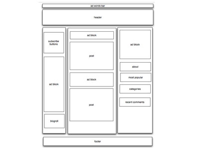
As you can see, there’s no “design” per se present. What we’re doing though is figuring out the optimal placement of the various blocks that make up our site. We’re establishing the hierarchy of the page elements; deciding what’s most important, where we want the users’ eye to move.
This is a very rich area of study. I’m going to try to boil it down to it’s most basic (this data comes from an article by Peter Faraday. In essence we perform 2 functions immediately upon landing on a web page: search, and scan. The search function is our eye looking for a salient entry point into the page. We are attracted by the following (in descending order)
Knowing this, we can make decisions in the layout and styling of our pages in order to increase the odds of generating the intended response (ie, clicking on an ad).
The eagle eyed among you may have noticed that we have more ad blocks than Google currently allows. We won’t be using them all at the same time, but we’re building them in so Frank has the ability to move the ads around.
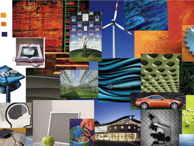
Step 5: Make a mood board (a collection of images, colours, type, etc that give you the feel you’re aiming for).
On larger jobs, we collect a bunch of imagery that feels like the project at hand. We look through magazines (fashion mags are a goldmine), books, and the web for colours, textures, layouts, etc. We cut up the magazines or print stuff out and literally make up a board that summarizes the mood we’re aiming to create for the site.
For a smaller job, we go through the same process, but create a virtual board instead. This is basically a big document in Photoshop that we can paste a bunch of stuff into. These images become our starting place for creating a colour palette, exploring texture and form, and generally acting as inspiration.
Creating one of these things doesn’t take long – go and try it, you’ll be surprised how much it helps.
Here’s an example from a recent project:
Step 6: Visual design
Having completed all of the above, the visual design is a much more manageable job than had we jumped straight in at the outset. Now we can concentrate on the site’s balance, energy, and style.
One huge mistake web design newbies make is not leaving enough space around the individual elements. This is called “white space”. Note that it doesn’t have to be white! Rather, the term refers simply to empty space.
At this point, you should be pretty well along in your design. I’m going to leave you now and get to work on Fred’s design.
Tomorrow, we’ll turn our static graphic into a WordPress theme.
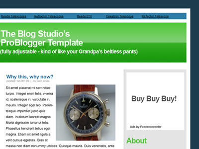
Before I go, here’s where I’m at with Fred’s site so far:
update: Peter’s just emailed to say he and most of his family are unwell. As a result, the next part of this mini series might be a day or two away. Stay tuned for part 2.
© 2010-2012 The Little Ganesha® All Rights Reserved. Subscribe in a reader
Hi all. I’m Peter Flaschner, the founder and creative dictator at The Blog Studio. I’m going to walk you through the process we go through when designing a blog or other website. This is part one of two. When we’re done, we’ll have a super flexible WordPress theme perfect for anyone looking to make a buck with a blog.
Design can add tremendous value to a blog. When it comes to making money with your blog, proper web design can make a huge impact on your bottom line. For some reason, I get a lot of resistance when I say this. I think it has to do with one’s perceived definition of design. The typical response I get is ‘ugly sites do well with adsense’. That may very well be true. I bet though, that those same sites would do even better with proper design.
Before we get into this, I need to dispel one further myth: design is not about making things pretty. It’s about making things work to their best ability. Let me quote from dictionary.com:
- To formulate a plan for; devise: designed a marketing strategy for the new product.
- To plan out in systematic, usually graphic form: design a building; design a computer program.
- To create or contrive for a particular purpose or effect: a game designed to appeal to all ages.
- To have as a goal or purpose; intend.
- To create or execute in an artistic or highly skilled manner.
We’re going to start by collecting a bunch of information. I know the instinct is to jump straight into your drawing program and start messing around, but it’s not the best approach. You’ll see why as we move through this.
We’re going to design a site for a fictional problogger. This person (let’s call him Fred) writes about watches. He’s earning a couple of hundred bucks a month from his current site, and wants to step that up.
Step 1: Identify the site’s goals (what are you trying to do? How will you achieve it)
We’re designing this site to increase Fred’s profit. We’re going to do this by designing a flexible framework for Fred to experiment with ad placement, by increasing the attention grabbing aspect in order to capture more first time visitors, and by increasing the site’s stickiness, giving users more chances to see an ad that they want to click on.
While we’re at it, we’re going to use a plugin we recently developed that will give Fred control over the colour of the various elements of his site. This way, he’ll be able to keep things looking fresh.
Step 2: Identify your audience (who are they, and where do they come from)
Fred’s audience is made up of two groups: hardcore watch nuts, who read Fred’s site for news and reviews of the latest timepieces, and people shopping for watches, who come to the site via searches for specific makes and models.
Step 3: Identify specific needs (what functions does the site need to have in order to meet its goals?)
Flexibility with a minimum of fuss is key here. We want Fred to be able to move ad blocks around without having to mess with the code. We also want Fred to be able to change up the look of his site to keep things fresh, again, without messing with the code.
We also want to increase the site’s stickiness. We’ll do this by including a “favorite posts” listing and related links in the post’s footer.
We’ll show a category listing, to allow readers to explore the site in a non-linear way, and a search bar, so readers can search for specific makes or models. We also want to include a blogroll, to share the love. Finally, we want to show recent comments, so Fred’s regular site visitors can keep up with the overall conversation.
Step 4: Draw wireframes (rough sketches to experiment with element placement and layout)
Now the fun starts. I use a fabulous program called OmniGraffle (mac only) to play around with site layout and element hierarchy (more on this in a moment). I like to stay out of my graphics editor, since the potential to get sucked into designing visual elements is so strong. You really want to avoid jumping into the visual part of the design at this stage, since you’ll just end up getting lost.
What we’re doing now is building the terrain that we’ll lay our visual elements over. Skipping this stage is is the single biggest mistake newbie designers make.
Here’s an example of Fred’s site in the first stages of development:
As you can see, there’s no “design” per se present. What we’re doing though is figuring out the optimal placement of the various blocks that make up our site. We’re establishing the hierarchy of the page elements; deciding what’s most important, where we want the users’ eye to move.
This is a very rich area of study. I’m going to try to boil it down to it’s most basic (this data comes from an article by Peter Faraday. In essence we perform 2 functions immediately upon landing on a web page: search, and scan. The search function is our eye looking for a salient entry point into the page. We are attracted by the following (in descending order)
- motion
- size
- images
- colour
- text style (font choice, font weight)
- position
Knowing this, we can make decisions in the layout and styling of our pages in order to increase the odds of generating the intended response (ie, clicking on an ad).
The eagle eyed among you may have noticed that we have more ad blocks than Google currently allows. We won’t be using them all at the same time, but we’re building them in so Frank has the ability to move the ads around.
Step 5: Make a mood board (a collection of images, colours, type, etc that give you the feel you’re aiming for).
On larger jobs, we collect a bunch of imagery that feels like the project at hand. We look through magazines (fashion mags are a goldmine), books, and the web for colours, textures, layouts, etc. We cut up the magazines or print stuff out and literally make up a board that summarizes the mood we’re aiming to create for the site.
For a smaller job, we go through the same process, but create a virtual board instead. This is basically a big document in Photoshop that we can paste a bunch of stuff into. These images become our starting place for creating a colour palette, exploring texture and form, and generally acting as inspiration.
Creating one of these things doesn’t take long – go and try it, you’ll be surprised how much it helps.
Here’s an example from a recent project:
Step 6: Visual design
Having completed all of the above, the visual design is a much more manageable job than had we jumped straight in at the outset. Now we can concentrate on the site’s balance, energy, and style.
One huge mistake web design newbies make is not leaving enough space around the individual elements. This is called “white space”. Note that it doesn’t have to be white! Rather, the term refers simply to empty space.
At this point, you should be pretty well along in your design. I’m going to leave you now and get to work on Fred’s design.
Tomorrow, we’ll turn our static graphic into a WordPress theme.
Before I go, here’s where I’m at with Fred’s site so far:
update: Peter’s just emailed to say he and most of his family are unwell. As a result, the next part of this mini series might be a day or two away. Stay tuned for part 2.
© 2010-2012 The Little Ganesha® All Rights Reserved.
Subscribe in a reader
